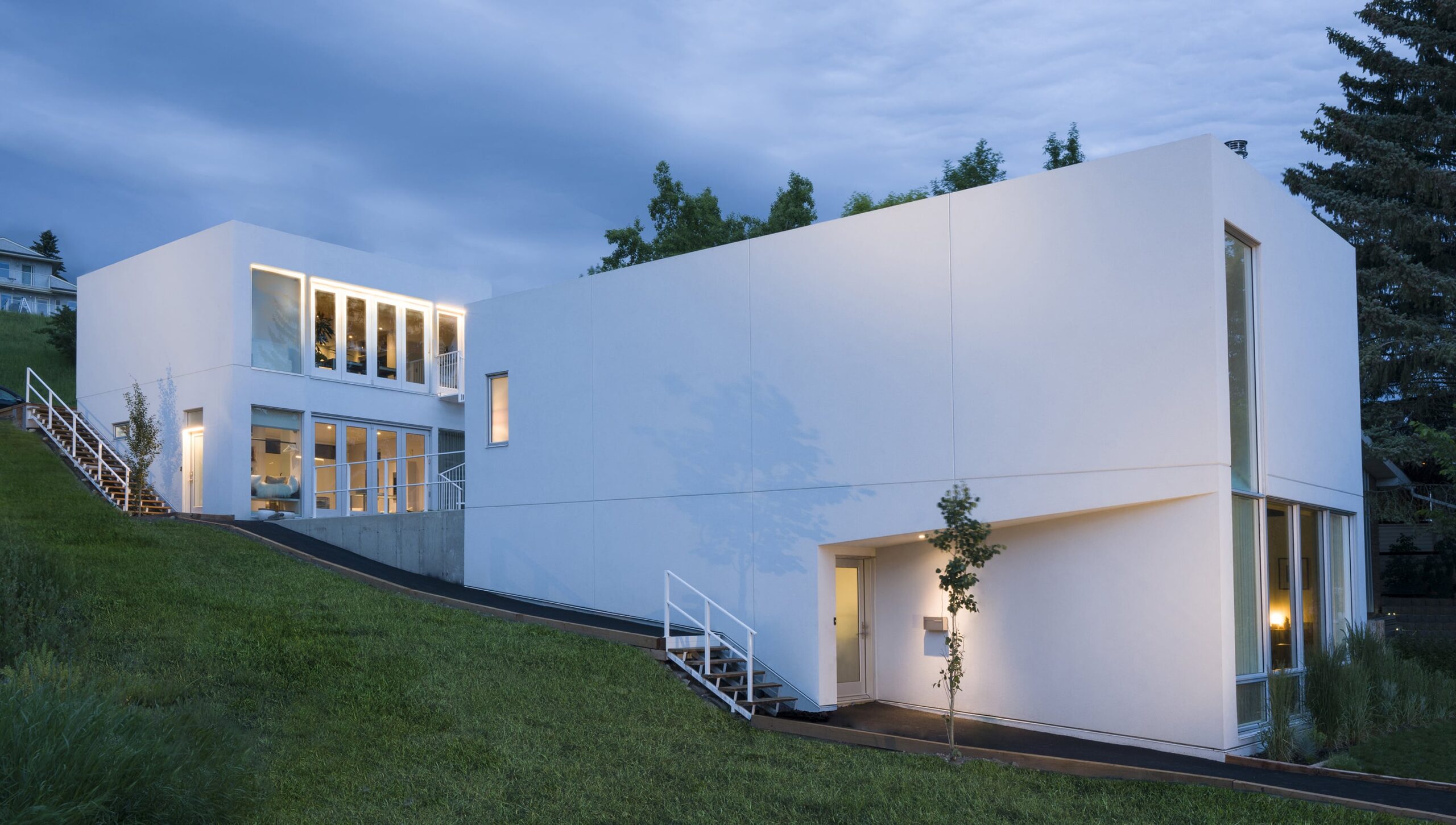
The White House is an infill project that explores the relationship between a residence and two studio spaces, one for each occupant of the residence. The project site is a narrow pie-shaped lot in an inner-city neighborhood characterized by a heavily sloped topography with the back being higher than the front, and city view opportunities towards the front.
The infill character of the site, its generous slope, and the nature of the clients as artists most fully defined the conceptual intentions and ambitions of the project.
On the one hand, the inherent nature of infill development with its capacity to bring natural light only at the front and the back, balanced with the client’s demand for light-infused spaces, suggested a courtyard solution. In addition, the sloped site suggested the capacity for multiple walk-out conditions and therefore multiple indoor/outdoor relationships.
On the other hand, the client’s collection of art and objets d’art and their own cultural production processes suggested flexible and adaptable spaces that simply set the stage for life and living, a type of infrastructure of possibilities.
The design concept posits a courtyard that both divides the residence from the stacked studios while simultaneously connecting these spaces visually, spatially, and as a threshold between the clients’ two realms of existence, that of living and that of making/disseminating. The studios, located at the top of the site, afford easy public access while presenting a common face to the courtyard, its natural light, and the upper level of the residence.
The residence, located at the lower portion of the site, establishes a neighborly aspect to the street by maximizing the visual connectivity of the living room. This is most fully achieved by sliding the front entry to access the house volume at the centre of the plan as opposed to the front, thereby optimizing the efficiency of the circulation while providing the most generous width for the house’s main living space.
Throughout both the interior and exterior of the residence and studios alike, simple white surfaces facilitate the play of light as well as the use of those surfaces and resultant spaces as backgrounds for the making and contemplation of art and living. This common palette of materials and light in both the living spaces and studio spaces establishes a common ground connecting life with art.
Photo Credit: YellowCamera
